Whether you are a driver or a pedestrian, doing the school run or drooling over your dream motor, it is fair to say that most of the population are surrounded by cars and adverts for cars most days of their lives. Manufacturers spend a lot of time and money creating brand identities that are intended to be easily recognised and remembered, but does all the exposure to car logos mean that the UK can remember what they look like?
To find out which car logos the general public can recall with ease and which ones they struggle to remember, we asked 100 people to draw 10 badges from well-known car makes in the UK as accurately as possible, purely from memory.
We analysed over 1,000 drawings, that took over 60 hours to draw, noting everything from the colours used, to the shapes remembered, the styling of the font and the impact of the smaller details. Our research revealed many memory mishaps, but also demonstrated which motoring legacies are seemingly engrained in our memories forever.
 |
 |
|---|

Alfa Romeo
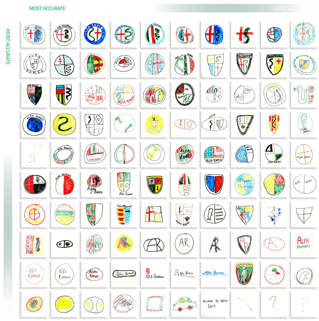
Alfa Romeo is a complex logo with many parts and drawing it from memory proved a difficult task. Steeped in heritage, the badge has two main features: a red cross on a white field, the symbol of Milan and a snake, the symbol of the Visconti family, one of Italy’s most important families.
Of the 100 drawings, only 26% of people remembered to draw the flag and 37% the snake, with just 17% remembering to draw both. The shape of the badge, which hasn’t changed since its conception in 1910, was seemingly the easiest element to recall, with only a quarter of people drawing a shield instead of a circle.
The Evolution of the Alfa Romeo badge

Audi
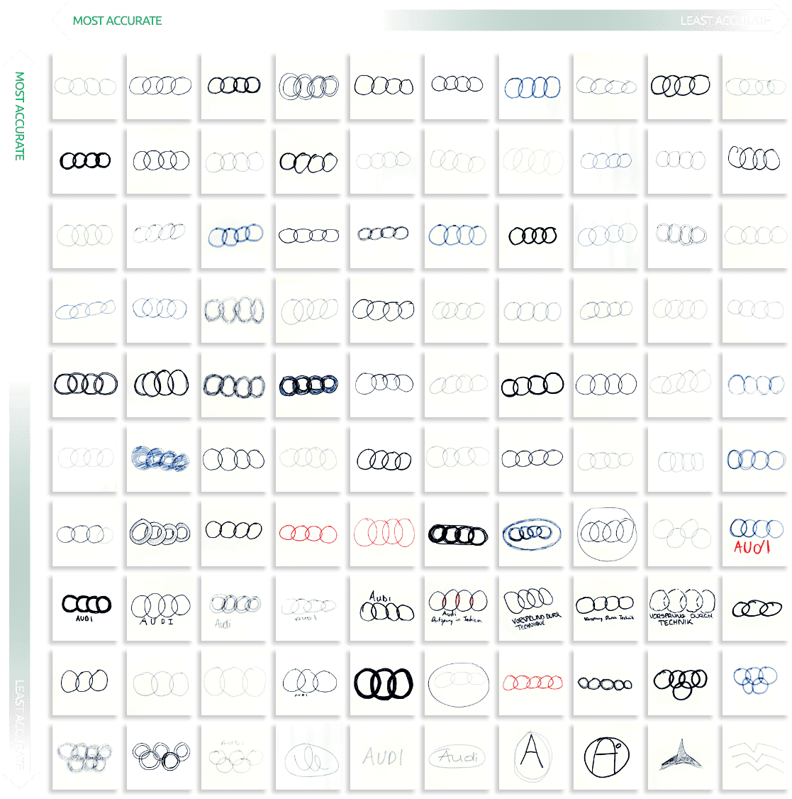
Audi has arguably the simplest badge, but 7% of people still failed to recall any of the logo details. The conception of the famous four rings was to reflect the four manufacturers of Auto Union; Audi, Horch, DKW and Wanderer that joined together to found the company in 1932.
Whilst 14% of people drew the wrong number of rings, 5% of people directly mistook the logo for the Olympic rings – perhaps unsurprisingly as the International Olympic Committee attempted to sue Audi in the international trademark court in 1995.
 14% drew the wrong number of rings
 5% drew a design similar to the olympic logo
 7% drew the logo completely wrong
The evolution of the Audi badge
![]()
![]()
![]()
![]()
![]()
![]()
![]()

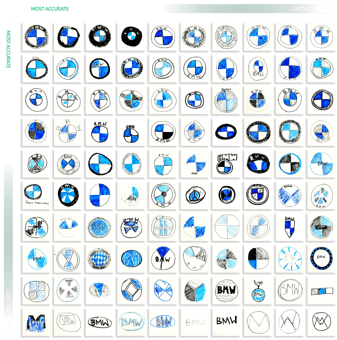
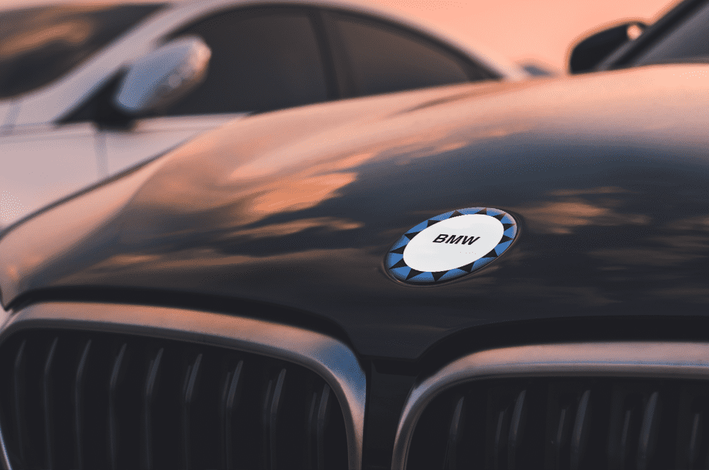
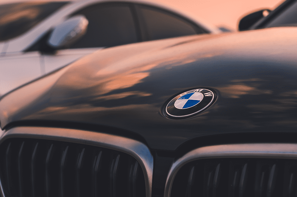
The simplistic design of the BMW badge combined with the unchanged colours made it easier for participants to recall the details of this well-known logo. The original logo was designed in 1927 and incorporated both the Rapp Motorenwerke logo (from which the BMW company grew) and the colours of the Bavarian flag.
The iconic blue and white colours were remembered by 92% of participants, with 93% of people also correctly drawing the circular shape of the badge. Whilst clearly a memorable logo, 41% of people couldn’t recall what format the blue and white colours were in, with a variety of shapes drawn.
 59% drew a quadrant layout
 92% used the colours blue and white
 7% didn’t draw a circular logo
The evolution of the BMW badge


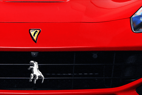
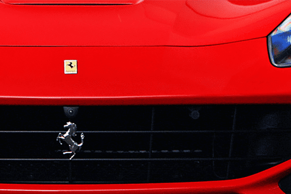
Ferrari
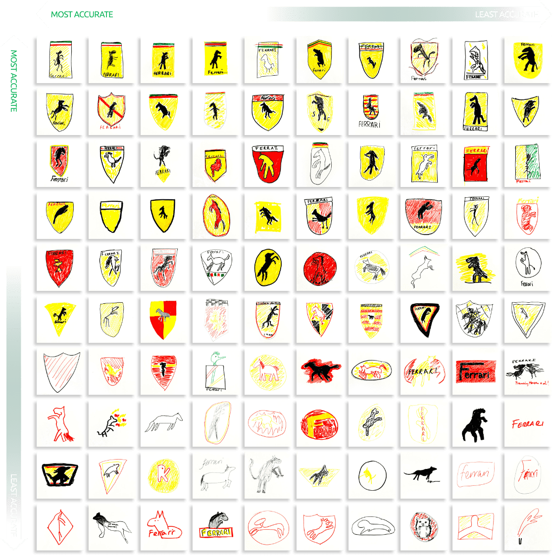
Whilst most people are unlikely to see a Ferrari on their daily commute, the aspirational brand is adored by millions, so much so the famous logo can be spotted everywhere from clothing and watches to backpacks and pencil cases.
Inspired by Countess Paulina, who claimed it would bring him luck, Enzo Ferrari painted a horse on his racing car. This was followed by a yellow background, the colour of his city of birth and the Italian flag colours, red, green and white.
Whilst the badges legendary canary yellow background and iconic prancing stallion were remembered by most, less significant details were lost, with less than half of the drawings containing the Ferrari wordmark and only 15% remembering the colours of the Italian flag. Interestingly, twice as many people opted to draw the badge’s shape as a shield over rectangular, a variation often used above the wheel arch of the Italian supercars.
 88% included yellow in their drawing
 82% attempted to draw the horse
 15% remembered the stripes
 49% drew the name on the logo
The evolution of the Ferrari badge

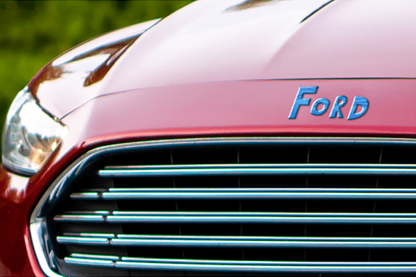
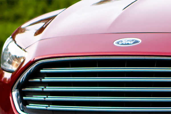
Ford
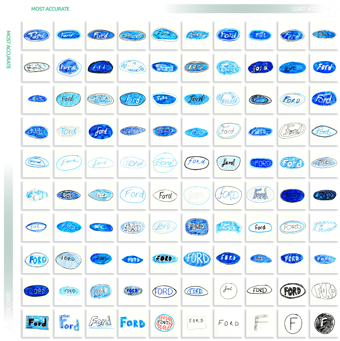
The Ford logo has barely changed in its 117-year history, with the recognisable italic font a fixture since 1907, and the iconic royal blue appearing 20 years later. Whilst most participants (89%) included the distinctive colour palette, only 58% of people attempted to draw the italic font for the brand name.
Overall the Ford branding is seemingly engrained in most minds, with only 10% failing to remember any element at all.
 90% drew the oval shape
 89% Included the colour blue
 58% attempted an italic font in their drawing
The evolution of the Ford badge
![]()
![]()
![]()
![]()
![]()
![]()
![]()
![]()

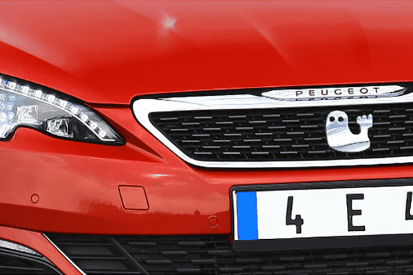
Peugeot
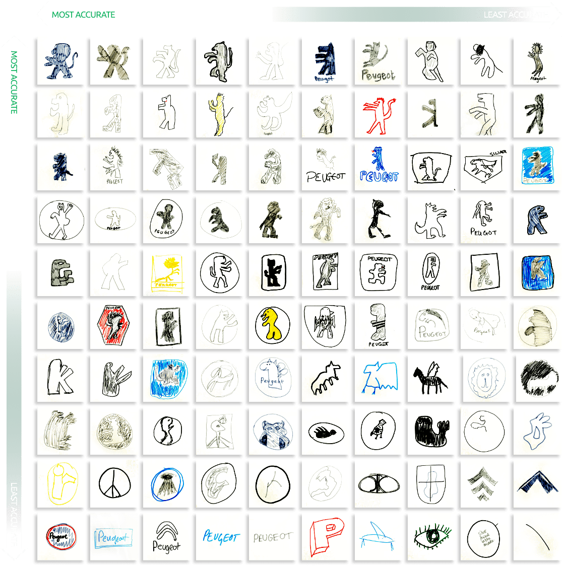
The Peugeot brand is summarised in one animal, a lion. The lion trademark was registered in 1858 by Emile Peugeot and whilst there have been many variations over the years, the lion has remained the sole feature of the brands logo.
Whilst seemingly iconic, 1 in 5 people didn’t attempt to draw any kind of animal at all, and for those who did, drew everything from a bird, winged horses, a whale and what looks to be a dead insect! A staggering 30% of participants drew the logo completely wrong and of the 52 people who did draw a lion-like creature, 25 of them drew it facing the wrong direction.
 20% didn’t attempt to draw any kind of animal
 25% drew the animal facing the wrong direction
 30% drew the logo completely wrong

The evolution of the Peugeot badge
![]()
![]()
![]()
![]()
![]()
![]()
![]()
![]()
![]()
![]()

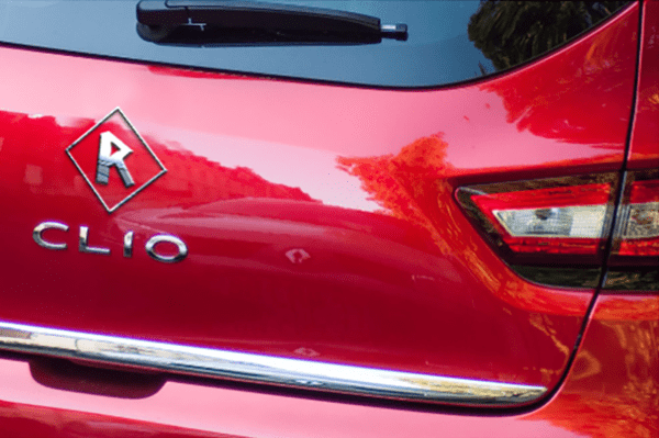
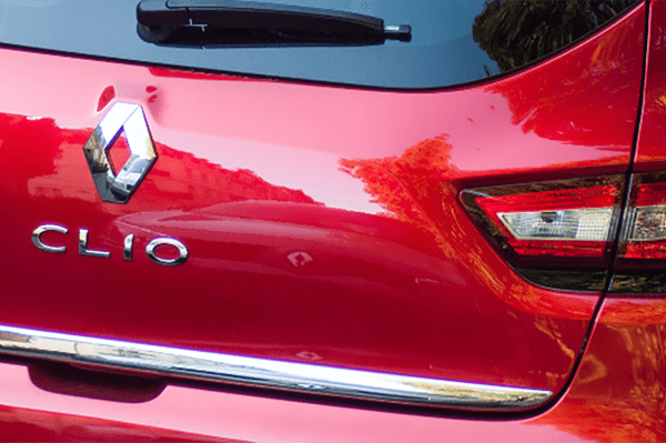
Renault
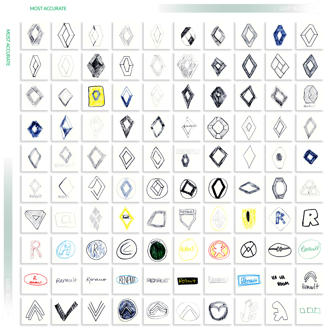
Founded in 1898 by three brothers Louis, Marcel and Fernand Renault, the original logo featured the brothers initials with two entwined Rs in an ‘Art Nouveau’ medallion and it wasn’t until the 1920s that the now well-known diamond took shape and the name Renault were introduced.
Whilst the logo has taken on many variations, the basic diamond shape was remembered by 71% of people who participated, but the smaller design detail of the overlapping struts was forgotten by all but 33 people.
Most interestingly of all the logos included, Renault was the brand most mistaken for something entirely different, with 11 people drawing something that resembled a different car badge entirely, including other French car brands like Citroen and Peugeot.
 71% drew a diamond shape of some kind
 11% drew another car brand’s logo
 33% attempted to draw the overlap detail
The evolution of the Renault badge
![]()
![]()
![]()
![]()
![]()
![]()
![]()
![]()
![]()
Toyota
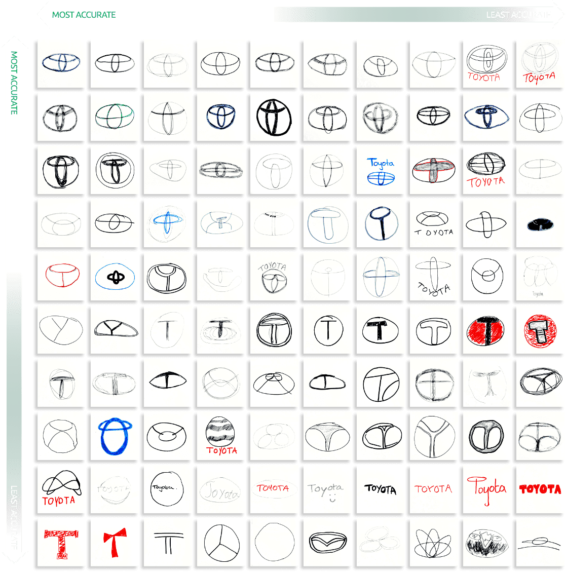
The brand’s first logo was a result of a public competition, during which the name Toyota was suggested as a replacement to Toyoda. It wasn’t until 1989 when the famous logo we recognise today was unveiled to commemorate the company’s 50th anniversary. That logo, still used today, has many meanings, including actually spelling out its own name within the inner structure, as well as looking the same whether viewed normally or through a rear-view mirror!
Whilst designers may have spent five years developing the logo, 32% of people didn’t include either of the inner ovals in their drawing and 19% failed to include any of the colours used. In fact, only around 16% drew the intersecting ovals correctly showing whilst well thought out, the logo is perhaps too complex for the public to recall.
 32% didn’t include either of the inner ovals
 12% drew the letter T
 19% didn’t get any part of the logo correct
The evolution of the Toyota badge
![]()
![]()
![]()
![]()

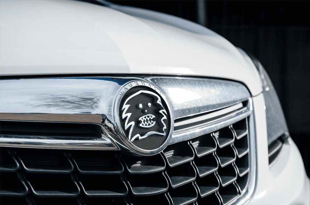
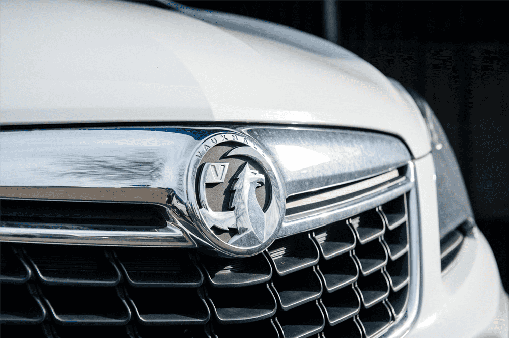
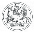
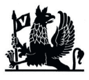
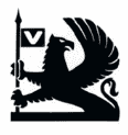
Vauxhall
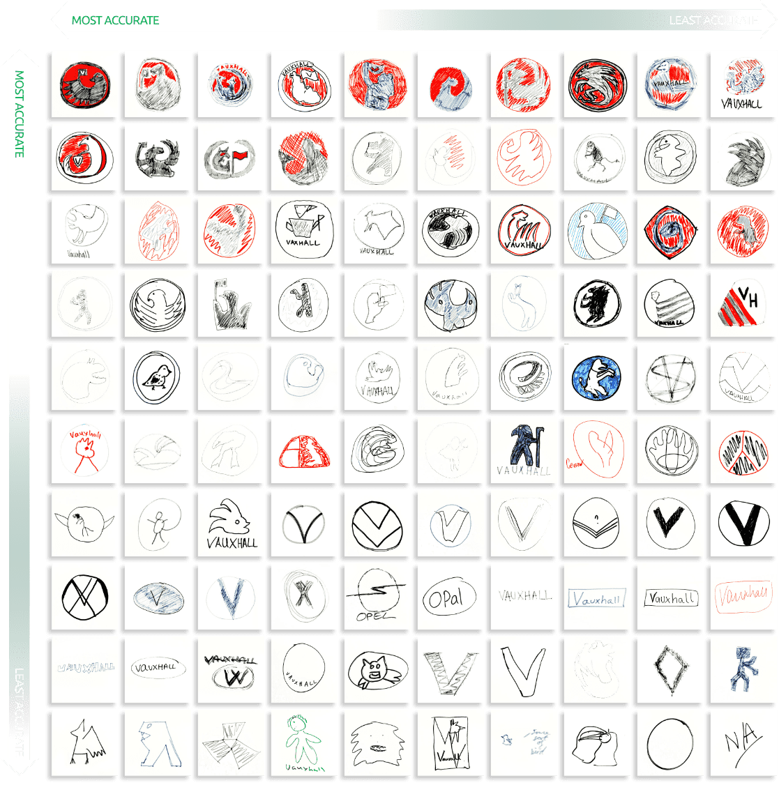
Since its conception in 1857 the Vauxhall logo has centred around a griffin, a mythical creature with the body of a lion and the head/wings of an eagle, which was inspired by the coat of arms associated with the area of Luton the company originated from. Whilst the logo has undergone many changes with more streamlined details, the griffin has remained the sole focus.
As perhaps expected, the griffin turned out to be both difficult to remember and hard to draw, with just 48% of people making an attempt. Of those attempts just 14% resembled a similar shape to the griffin on the badge. Smaller details such as the flag containing a V were forgotten entirely, with only 9% of drawings including this element.
 11% drew a V
 26% Included the colour red
 48% attempted to draw a griffin-like creature
 9% drew the flag
The evolution of the Vauxhall badge
![]()
![]()
![]()
![]()


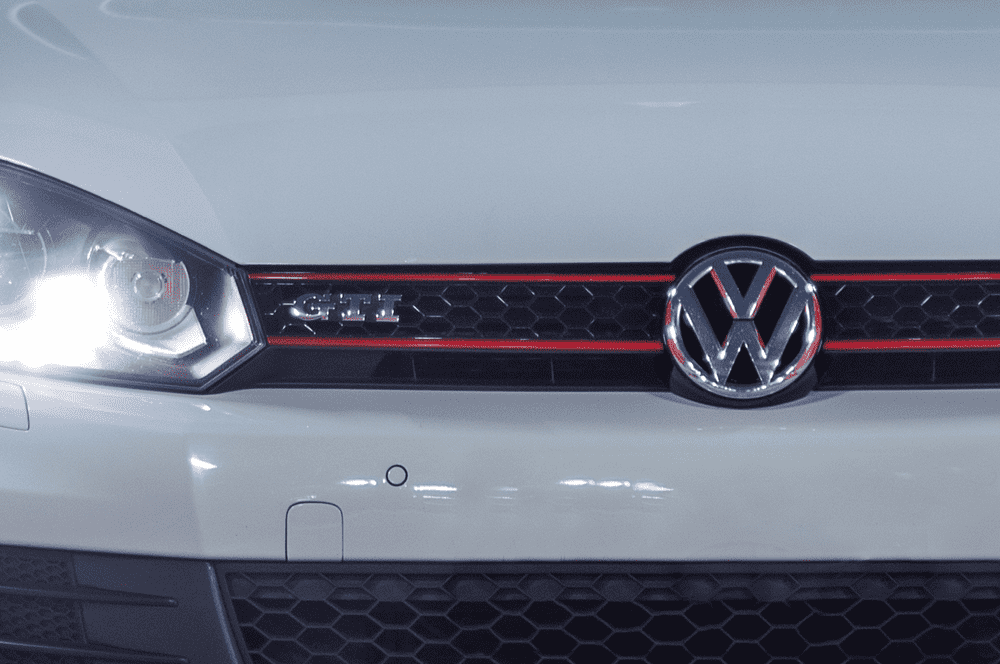
Volkswagen
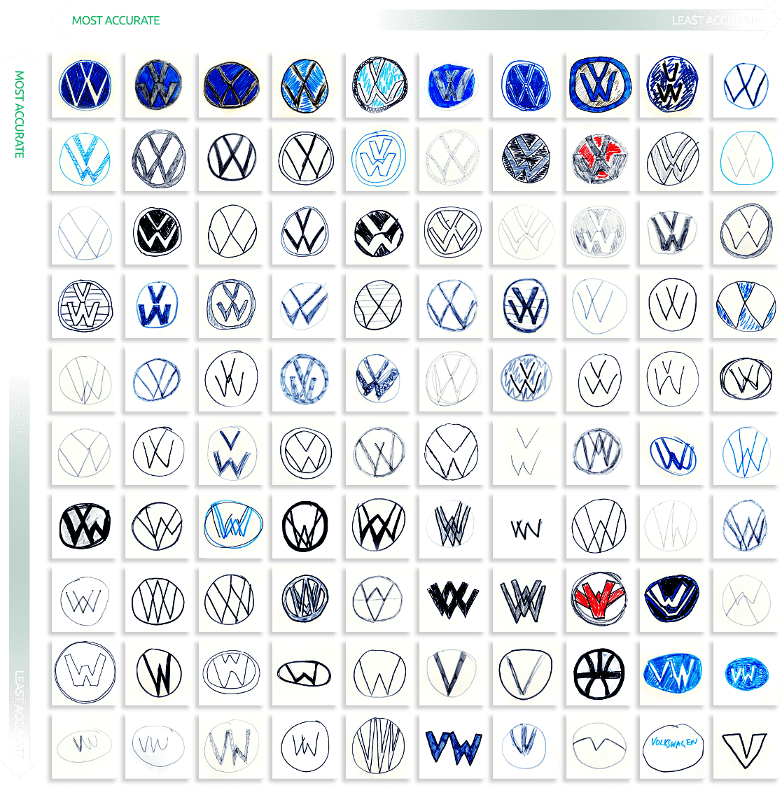
Dating back to 1938, the Volkswagen logo compromises of two letters a V placed above a W and has remained relatively untouched throughout the brands history. Perhaps that is why the badge could be seen has the most successful in our test, with only 2% failing to remember it contains a V and W or both.
That said the precise layout of the letters were hazy in many of the participants minds, with 17% of people drawing the V and W intersecting instead of on top of one another and 9% drawing just one of the two featured letters.
 17% drew the V and W overlapping instead of on top of each other
 93% drew a circular shape
 9% Drew the V or W and not both together
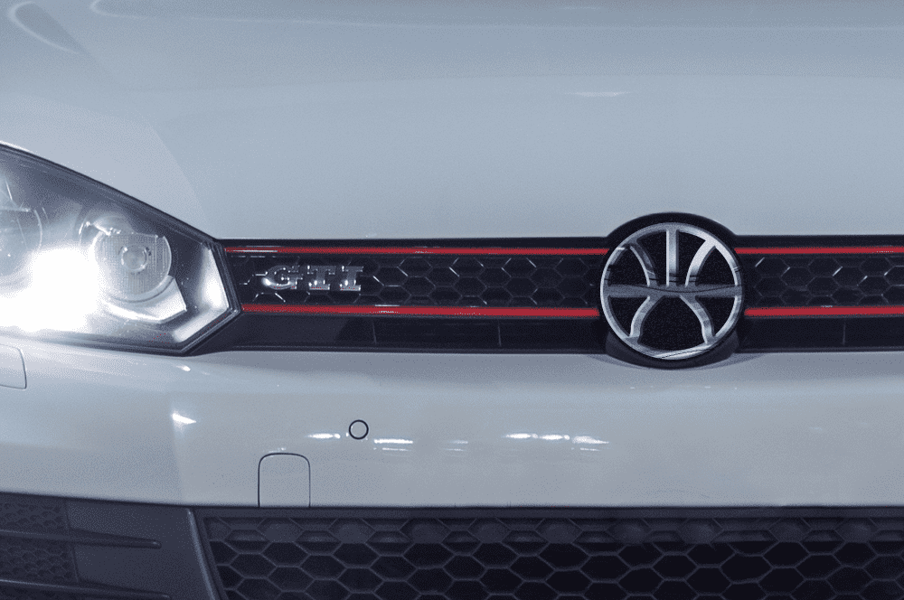
The evolution of the Volkswagen badge
![]()
![]()
![]()
![]()
![]()
![]()
![]()
![]()
![]()
Expert opinion
We caught up with Charlie Bell, Creative Director at Whitespace; one of Scotland’s leading creative agencies. He gave us his thoughts on the future of car branding…
“We are witnessing a massive shift in the automotive industry. Technology has infiltrated every aspect of it. Self-driving cars, interactive dashboards, GPS, smart lanes, AI traffic systems. Tesla has ripped up the rule book in term of branding. Tesla is not just a car company, it’s a tech brand. They act more like Apple than they do Ford.
“And car brands have reacted. We are seeing traditional car brands refining their look to be more in line with the current trend of flat vector graphics. Gone are the shiny chrome effects in logos for many brands. Volkswagen, Toyota, Lotus, Hyundai, Audi and Mini are just a handful of automotive brands opting for a more minimal approach.
“And it is telling that the logos people could recall best where the simplest yet most striking.”
 Charlie Bell | Creative Director, Whitespace
Summary
We set out to see how well we can recall the badges of 10 well-known car makes. So what do the results show us? Whilst around 80% of drawings used the right colours, and 78% of the main badge shapes were drawn correctly, further detailing was more difficult to remember.
Despite some of these badges remaining consistent over decades, the patterns and pictures featured are too much for many minds to recall. Overall only 12% of drawings were near perfect, and 26% were good but not perfect. Generally, as expected, the simpler the logo, the more accurately participants were able to recall and draw it.